A quick peek at some food photography I did recently. It's always challenging to photograph raw fish so I'm quite happy with these two shots.
iTunes: a Problem with Apostrophes

In 2014, D'Angelo released his third studio album, Black Messiah. In addition to being a fantastic piece of work that's received critical acclaim, it's notable because fourteen years had elapsed between its release and the release of his second album, Voodoo.
For me though, Black Messiah is notable because I can't find it in iTunes. My mental model when I look for an album or a song in iTunes is almost always to search by artist first and then refine my search from there. There are rare cases where I search directly for one song – Alice Cooper's Poison is an example – but for the most part, I search by artist. And that's where iTunes lets me down…
Read moreDishoom Carnaby Street
Autumn has crept into London quietly and with it has come a new Dishoom, this time just off Carnaby Street. We had lunch there last week and previewed the new space – unsurprisingly, it doesn't disappoint in the slightest. The details, as always, are exquisite.
This wall of shutters separates the bar from one of the dining areas. Gorgeous.
The stairwell has beautiful light fixtures which, when paired with the wood walls, create a tremendous sense of the mid twentieth century era.
The hallway to the bathrooms has these reproductions of vintage Air India travel posters. I particularly like that at some point in the past few decades, Air India thought that "naughty pictures" offered by a beret-toting, moustached character in an overcoat was a major selling point for Paris.
Beautiful wooden doors, and more lovely light fixtures.
Don't miss the jukebox! Just incredible – look at those details!
Brush lettering
TfL's Night Tube Logo: Beauty in the Details
The logo for TfL's Night Tube Service has two gorgeous little details. The eyes and the beak of the owl are glyphs (o's and dot of the i, respectively) that are pulled directly from their official typeface, Johnston Underground. It's not just a clever touch though – details like this help make the logo feel instantly familiar and unify it with the rest of TfL's visual language.
Hanoi, Part Two
More photos from our brief stay in Hanoi.
Hanoi
Some select shots from the streets of Hanoi, Vietnam. The interiors are all from the Temple of Literature.
IFTTT's Animated GIF

Just the right amount of animation, stretch, bounce and easing.
Mesmerising.
Update: in contrast, here's an example of what might be the dullest animated GIF ever to be crammed into a marketing email.
Sign-painting

Absolutely gorgeous.
Source: a recent Better Letters email
Yeast Bakery's Mince Pies
I'm tempted to say, right off the bat, that these are the best mince pies in London. If they're not, they're certainly a contender for that title, something I feel somewhat qualified to judge*.
Yeast Bakery's mince pies are beautiful. Every single part of them feels as though it was created with love, care and attention. The details are beautiful and carefully considered as well. When I picked up the box, I was immediately drawn to the paper tags, a lovely, off-white, natural paper with a lovely toot. When I complimented Angela (one of the owners) on the tags, she laughed and told me that she'd made the paper herself. Astonishing.
And then there are the pies themselves:
They're beautifully constructed and perfectly baked. The short crust pastry is surprisingly substantial and gives these pies a wonderful weight – they don't fall apart in your hand like the Duchy Originals. That weight only enhances the experience in that each pie feels more solid and more real than say, the thin crust mince pies from Konditor and Cook. As you'll see below, the pastry maintains its shape and rise even as it's being eaten.
Form aside, they're delicious. The mince filling is rich, moist and perfect. It's a classic mixture of fruit and feels instantly familiar without being tired. It's a perfect example of how if something isn't broken, it shouldn't be fixed (Heston Blumenthal should take note). Frankly, I can't wait to go back this Saturday for more.
Yeast Bakery (map)
Arch 356
Westgate Street
London
E8 3RL
Open to the public Saturdays
* When I worked at Reevoo, a colleague brought in every single brand of mince pie available and we spent a morning tasting and reviewing them. He and I also once tracked the number of mince pies that we consumed in the month of December. It was well over 30 pies each when we called off the tally.
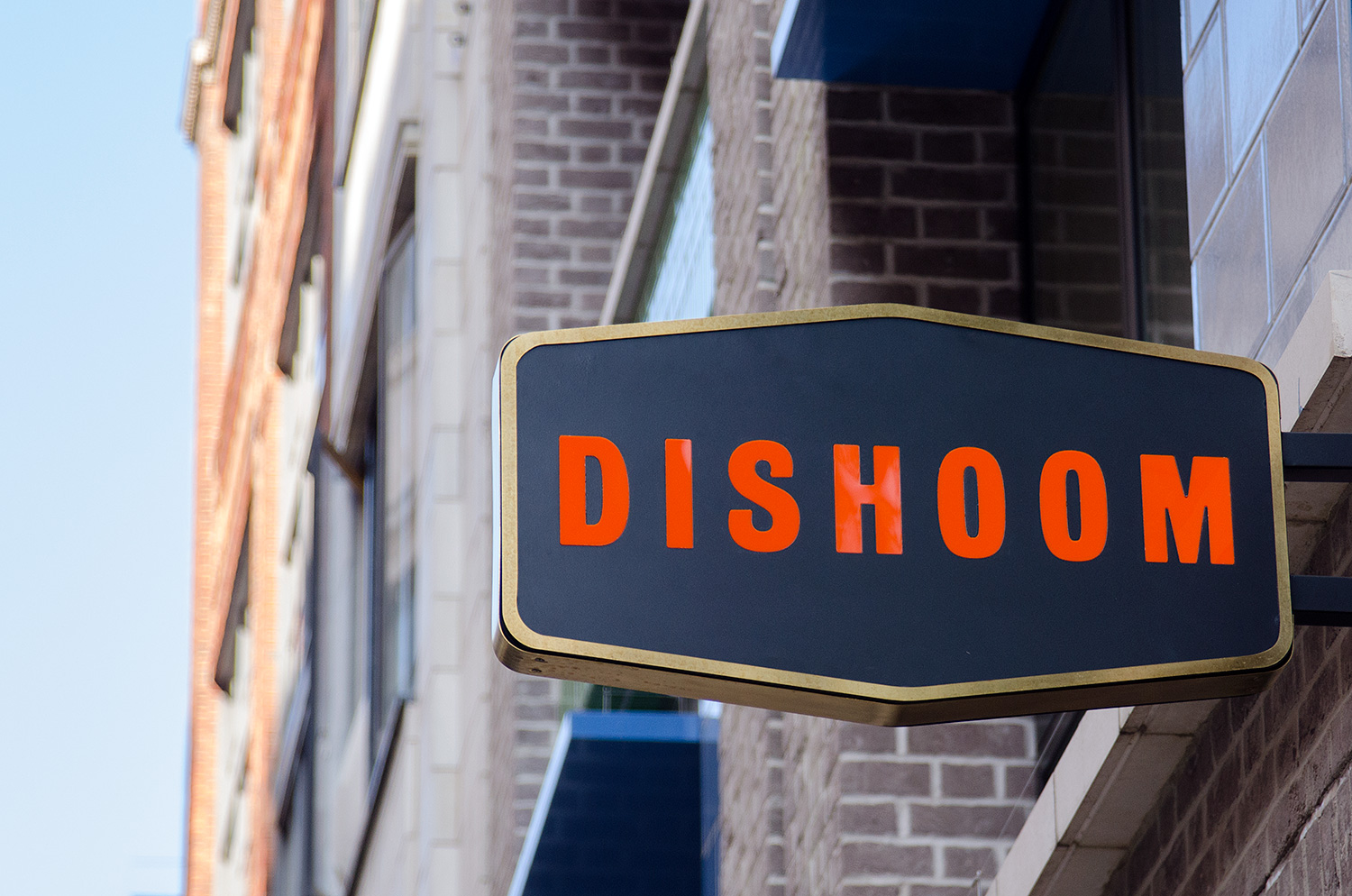
The Details of Dishoom
A smattering of shots from the new Dishoom in Kings Cross.
Film Logotype: Guardians of the Galaxy
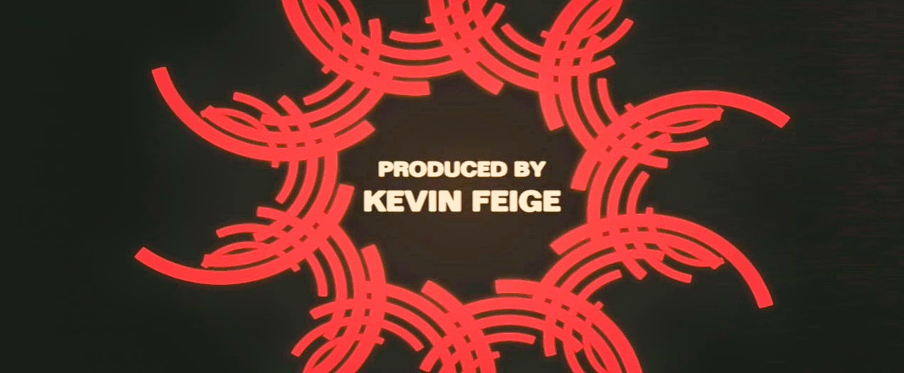
I've written before about Marvel's attention to design when it comes to film titles and end credits and the new trailer for Guardians of the Galaxy is no exception. I'm rarely a fan of movie logotypes, particularly within the science fiction and action genres – they're often clichéd treatments involving chrome/metal, 3D extrusions, gradients, rough or degraded typography, and the same fonts.
For me, the logotype for Guardians of the Galaxy is the exception to the rule, in no small part thanks to its details. The 3D extrusion is minimal and elegant. While there's still a metallic treatment, it's somewhat unique in its subtly (compare it to any of the typographic treatments for any of the Robocop films, remake included) and in that the metal is rusted, worn and old.
But really, it's the details in the lettering that delight me: the way the letterform of the U accommodates its neighbouring A; the overlap of the T and the H in the smaller text. It shows care and attention to detail.
Interfaces and Positive Feedback
I really enjoy the positive feedback that Duolingo employs. Once in a while, it's unintentionally funny, as seen below:

Film Titles: All Hail the King
I'm a big fan of the current series of Marvel Studios* films. Marvel has brought titles and characters like Thor, Iron Man, Captain America and the Avengers to the big screen with skill and passion, all while respecting the source material.
One of the things I enjoy almost more than the films themselves is the Marvel One-Shots – shorts that take place in the same universe and often deal with the minor or supporting characters. The latest of these One-Shots is"All Hail the King", which deals with events from Iron Man 3.
While the short is funny and very well executed, the best parts for me was the title treatment and the end credits. With visuals that would feel right at home in a late-70s exploitation or spy film, the titles are awash in colour, geometry and motion. They're a treat to behold, right down to the slightly fuzzy, indistinct letters.
The opening title treatment:
A few stills from the end credits:
And an example of the absolutely stunning (hypnotic?) animation:
The designers of the titles, Perception, wrote up their process for their website. It's a fantastic read and a great insight into their process and execution.
* As opposed to the Marvel properties currently being developed by other studios such as Sony's Amazing Spider-Man and Fox's X-Men.
New work: Valentine's Burgers
This is a tradition that L and I share: we've been going for burgers with friends on the 14th of February for nine consecutive years. That said, this is the first year I bothered creating an invitation for our little outing. I limited myself to a couple of hours on this one so there are a few problems here and there but you've got to admit: that's a pretty nice B.

An ordinary life – revised
Something I'm tinkering with – the proof-reader's marks aren't quite right yet and the positioning of "less" isn't quite working but the sentiment is spot on.

Continuing on…
My previous blog (more like an online sketchbook, really) can still be found at designmonkey.blogspot.com, but I'll be writing here from now on.