
My long-term collaborator and friend, Mike Wood, has put some of the most interesting projects across my desk. When we lived in London…
Read moreSlack Glitch
Here's what happens when you encounter a major glitch in Slack, the productivity tool. All things considered, it's a rather nice way to make a bad situation a little less unpleasant for the user.
Choosy Icon
Choosy is one of those tiny pieces of software that quickly becomes indispensable. Its premise is beautifully simple: open the right link in the right browser, every time.
That premise belies its incredibly power though. Choosy also lets you set behaviours and customs actions. Always open mail:to links in Chrome? No sweat. Send a link from Chrome to Safari? Easy. The accompanying extensions – for all of the major browsers – make that a piece of cake.
I was introduced to Choosy by George Brocklehurst, a former colleague and Choosy's creator (when he saw me copying and pasting links between browsers). I used it for years and was dismayed when it finally stopped working because of changes in OSX.

The old version of the Choosy icon
When it came time to update Choosy, I happily took George up on his offer to update the icon. The previous icon felt complicated, especially given how simple Choosy is to use. In fairness, the original icon was a product of its time and reflected Apple's Aqua aesthetic with reflections, gradients, and 3D effects.
My goal for the icon’s redesign was to simplify it as much as possible. It needed to feel elegant, simple, and straightforward.
After some thought, I chose to base the new version on one of the original icon’s triangles. This creates a tie between the original icon and the new one. It's a strong geometric element and communicates the concepts of direction, navigation and movement.
Finding the proper balance of the C to the triangle proved to be a surprising challenge (turns out that mathematical alignment was completely visually wrong). I also found drawing a geometrically perfect triangle with rounded corners very, very difficult (I was trying to use the Pathfinder tool to merge circles with the corners of a triangle and then remove the negative spaces).
Eventually, I realised that Adobe had probably solved this problem. A quick Google search later and I used the incredibly simple “round corners” option. ಠ_ಠ
In the end, I’m very happy with how the final version turned out. A particularly difficult challenge was ensuring that the icon represented well at all sizes – as small as 16 pixels square, for use in the Apple menu bar and as a favicon (the 16 pixel square version actually has a slightly different layout and font weight to render properly).
The final icon. From left to right at 1024 x 1024, 512 x 512, 256 x 256, 128 x 128, 64 x 64 and the tiny 16 x 16!
And here’s what Choosy looks like when it’s running in your Mac’s menu bar:

You can buy Choosy for $10 USD. It’s worth every penny.
SuperLocate
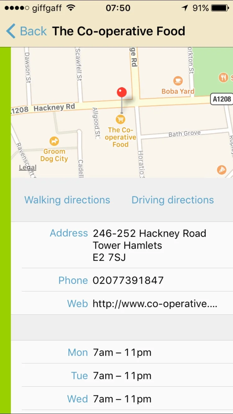
In 2013, my friend (and former colleague at Reevoo) Chris Zetter released an iPhone app, SuperLocate. Like all good apps, it solves a problem that he had: how to find the nearest grocery store.
I volunteered to help with the interaction design and the flow of the user journeys. Additionally, I contributed to the visual styling and the refinement of the app icon.
Overview
The app opens with half the screen devoted to a map view, and the other half a list of the nearby grocery stores. If the user touches the map, the list collapses. This allows the user to pan and zoom the map to refine their search.
Selecting a grocery store from the list brings up the hours of operation, as well as giving the user options for walking and driving directions, and calling the store.
Early Sketches
Sketch for main screen (top) and the About/credits screen (below)

Sketch of supermarket screen (top) showing opening hours, walking and driving directions
Main screen
Main screen with listings visible
Supermarket screen
Icon design (from left to right): original, revised, alternate revised
The app is simple, intuitive, and a brilliant little side project from a very talented developer. Check out Superlocate (App store link) on the UK App store.
iTunes: a Problem with Apostrophes

In 2014, D'Angelo released his third studio album, Black Messiah. In addition to being a fantastic piece of work that's received critical acclaim, it's notable because fourteen years had elapsed between its release and the release of his second album, Voodoo.
For me though, Black Messiah is notable because I can't find it in iTunes. My mental model when I look for an album or a song in iTunes is almost always to search by artist first and then refine my search from there. There are rare cases where I search directly for one song – Alice Cooper's Poison is an example – but for the most part, I search by artist. And that's where iTunes lets me down…
Read moreTfL's Night Tube Logo: Beauty in the Details
The logo for TfL's Night Tube Service has two gorgeous little details. The eyes and the beak of the owl are glyphs (o's and dot of the i, respectively) that are pulled directly from their official typeface, Johnston Underground. It's not just a clever touch though – details like this help make the logo feel instantly familiar and unify it with the rest of TfL's visual language.
IFTTT's Animated GIF
Just the right amount of animation, stretch, bounce and easing.
Mesmerising.
Update: in contrast, here's an example of what might be the dullest animated GIF ever to be crammed into a marketing email.
Interfaces and Positive Feedback
I really enjoy the positive feedback that Duolingo employs. Once in a while, it's unintentionally funny, as seen below:

An ordinary life – revised
Something I'm tinkering with – the proof-reader's marks aren't quite right yet and the positioning of "less" isn't quite working but the sentiment is spot on.
