Reevoo Mark
Reevoo's primary product is a system for users to find, share and leave genuine owner reviews. The display of these reviews to shoppers is called Reevoo Mark.
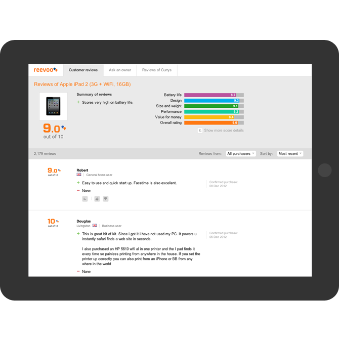
Reevoo Mark displays a product's rating, as a score out of ten, alongside a number of other scored attributes. These numerical ratings, while valuable, are not as important as the individual reviews left by reviewers.
The content of these individual reviews is enormously complex and displaying it in an intelligent readable manner was the key design problem.
The basic Reevoo Mark lightbox
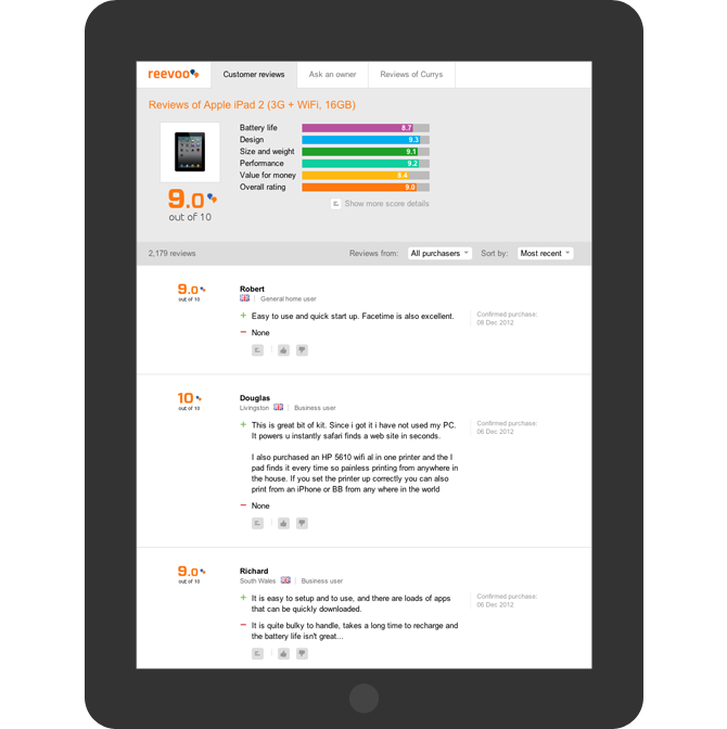
The bottom of the Reevoo Mark lightbox, with segment breakdowns
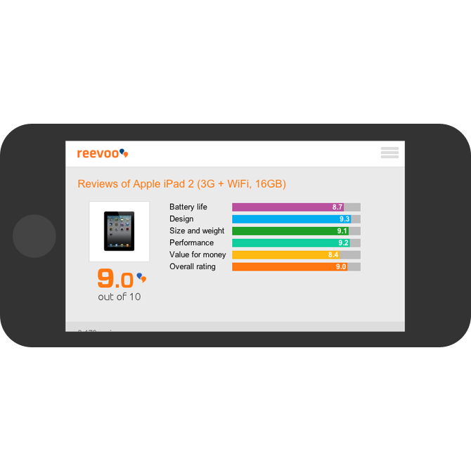
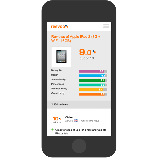
I completely redesigned the interface, user flow and visual design to be fully responsive with an emphasis on content.
The solution is a clean, clear layout and interface that places emphasis on readability, legibility, and the ability to scan content. The entirety of the visual design is accomplished through the browser, with high-resolution icons and symbols delivered via a custom font.
Edge Cases and Complexity
Further complicating the problem were the numerous cases which had to be accommodated. These included:
- localisation in 18 languages (all major European, Scandinavian as well as Japanese, Korean and Japanese)
- user details which could include a name, locale, country flag, segment type, a short description (user-generated), and a Facebook profile photo
- reviews collected from owners who received a pre-launch version of the product
- individual graphing bars per review
- the ability to rate each review as helpful or unhelpful
- a buy button
- sharing functionality
- permalinks to individual reviews
Edge case: a review for a pre-release product
Edge case: highlighting a specific review to the user with sharing functionality
Edge case: Facebook integration, product model and length of ownership details
Responsive Layouts and Breakdowns