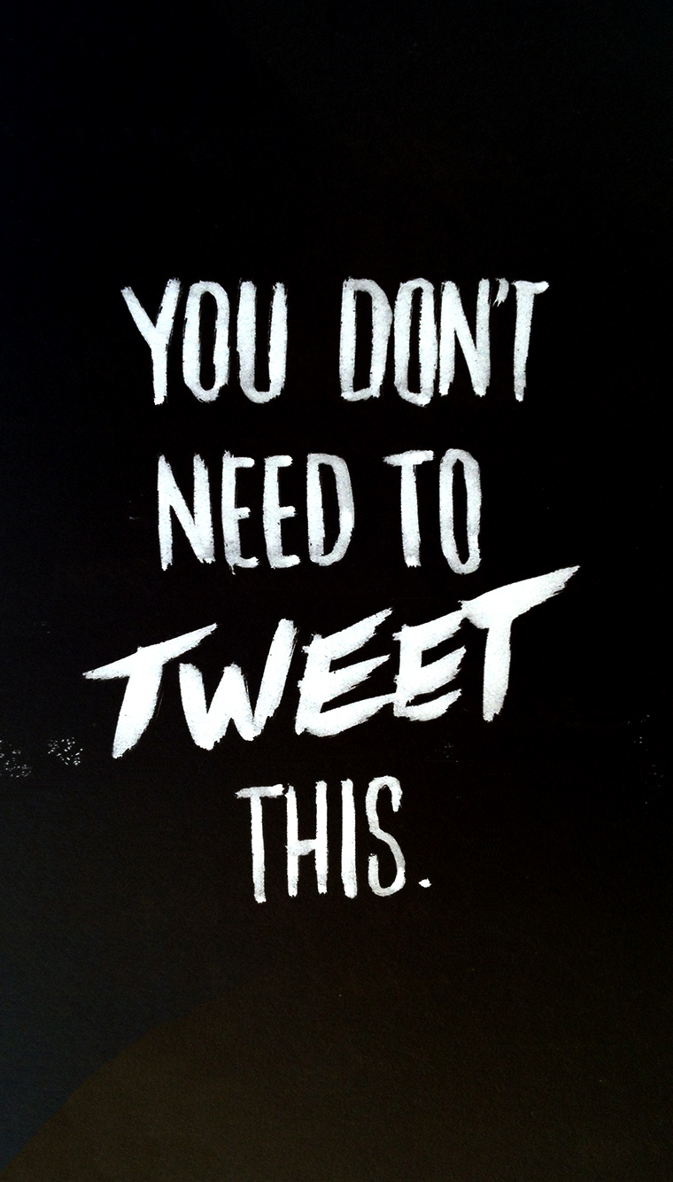
With last year's being light-hearted, it stands that this year's sentiment is a bit more serious. By the way, the image above happens to be the perfect size for your iPhone's wallpaper.
The Hype Machine II: The New Pornographers
Following up on my previous work for the Hype Machine, I was asked to create a piece of work representing the Canadian supergroup, The New Pornographers. I felt it critical to avoid the obvious connotations of the name so I created a piece of lettering whose aesthetic paid homage to the Rat Pack, the Vegas of days-gone-by, cocktail lounges and luxury.
The final piece
The Process
There were a couple of concepts that I considered for this piece: London tart cards (the postcards left by escorts in London phone booths), Times Square in the 1970s, and cheap ads found in the back of seedy men's magazines.
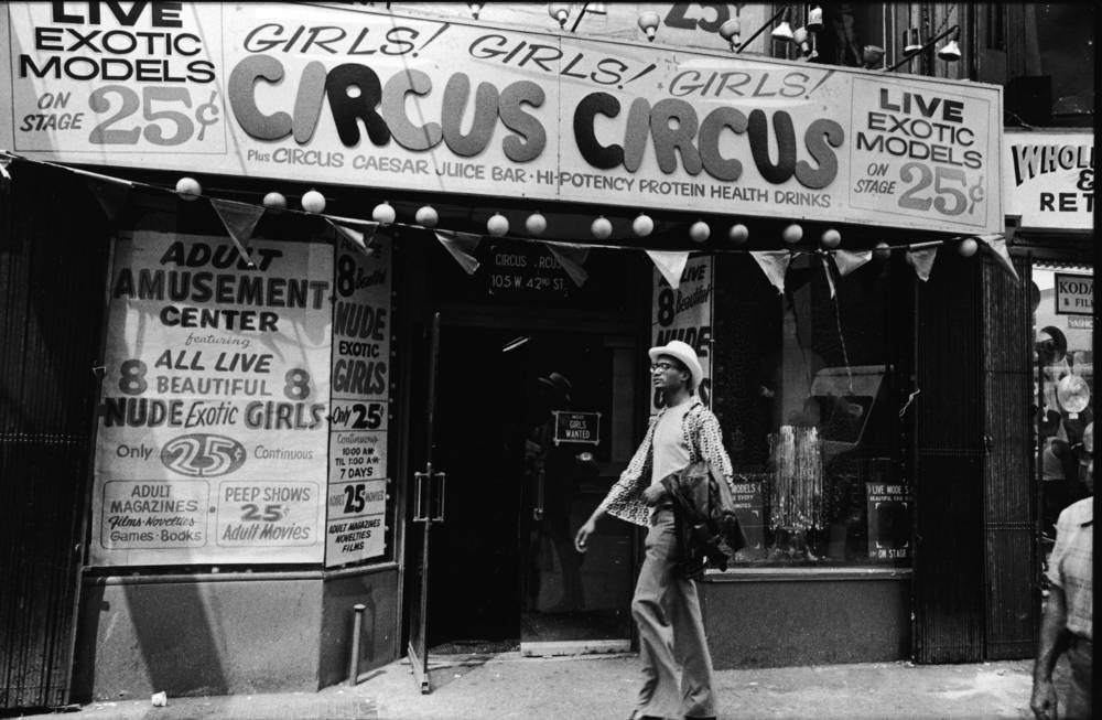
Times Square in the 1970s

Tart cards

Sleazy classified ads
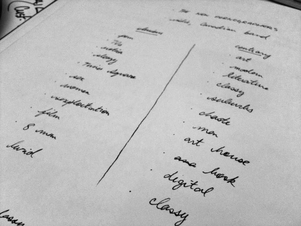
While sketching out possible layouts, it struck me these concepts and any variation on them were far too obvious. As such, I quickly wrote out a list of adjectives corresponding to my concepts and then tried to think of antonyms.
Classy, modern, and art house stuck out as keywords (classy appeared twice somehow). With these in mind, I then sketched out a couple of layouts before settling on the final piece.
The Faltering Hearts
The Faltering Hearts, a ukulele trio of women, approached me to design a logo for them. Their previous logos had been clichéd, obvious approaches based on hearts, usually accompanied by overly-decorative typefaces. Considering that the Faltering Hearts are quite a unique group, I suggested a hand-lettered approach to make the logotype feel human, distinctive and warm.
Read moreAlice … in Wonderland

A book cover with custom lettering that I created for as a gift. Whimsical? Ornate? Excessive amounts of flourishes? Seemed like a good fit for the Victorian nature of Lewis Carroll's most famous work.
The Hype Machine: Camera Obscura
The Hype Machine asked me to contribute an illustration to their Annual Zeitgeist. With Camera Obscura as my chosen artist, I sketched a few different concepts, one of which was a highly-illustrative execution with inverted typography (like a true camera obscura).
In the end, I settled on the simpler execution above: lettering which references the pulp magazines and horror films of the 1930s. The application of texture to mimic shoddy printing and some scratch/hashed type helped round it off nicely.

Another rotation around the sun
While cleaning out my files, I rediscovered these somewhat cynical birthday cards that I made a few years ago. While the lettering isn't the most refined, I quite like the writing. Despite this being a personal project, there was still an approval process – Leah vetoed a few of the copy options including "ONE STEP CLOSER TO THE GRAVE". ;)
On New Year's Resolutions

A silly little graphic I made for those suffering through a healthier January. Available as an iPhone 6 and iPhone 6 Plus wallpaper.
Brush lettering
Sign-painting

Absolutely gorgeous.
Source: a recent Better Letters email
Film Logotype: Guardians of the Galaxy
I've written before about Marvel's attention to design when it comes to film titles and end credits and the new trailer for Guardians of the Galaxy is no exception. I'm rarely a fan of movie logotypes, particularly within the science fiction and action genres – they're often clichéd treatments involving chrome/metal, 3D extrusions, gradients, rough or degraded typography, and the same fonts.
For me, the logotype for Guardians of the Galaxy is the exception to the rule, in no small part thanks to its details. The 3D extrusion is minimal and elegant. While there's still a metallic treatment, it's somewhat unique in its subtly (compare it to any of the typographic treatments for any of the Robocop films, remake included) and in that the metal is rusted, worn and old.
But really, it's the details in the lettering that delight me: the way the letterform of the U accommodates its neighbouring A; the overlap of the T and the H in the smaller text. It shows care and attention to detail.
New work: Valentine's Burgers
This is a tradition that L and I share: we've been going for burgers with friends on the 14th of February for nine consecutive years. That said, this is the first year I bothered creating an invitation for our little outing. I limited myself to a couple of hours on this one so there are a few problems here and there but you've got to admit: that's a pretty nice B.
